Iconography
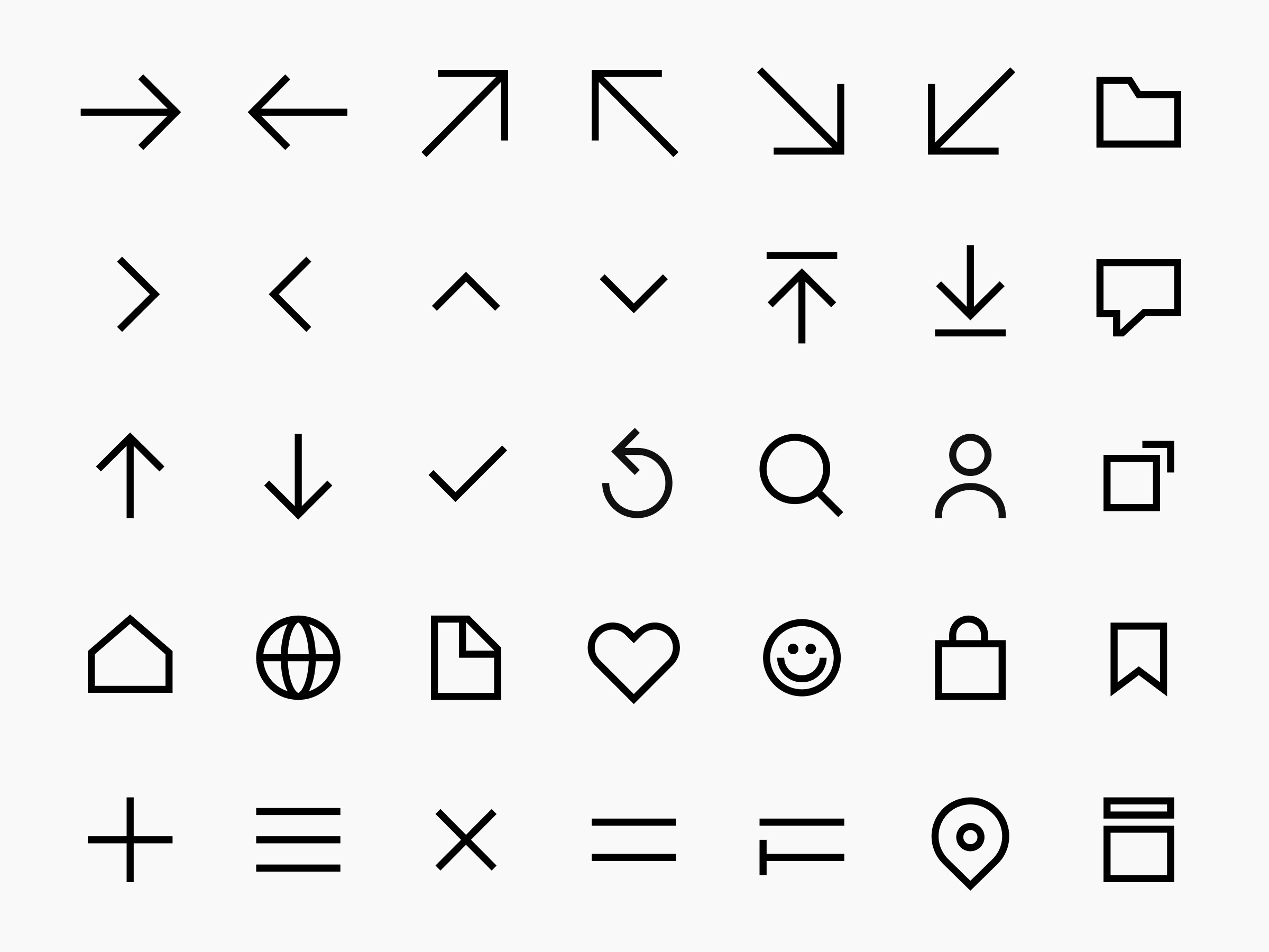
Iconography allows communication that goes beyond words and language. So we've come up with a range of custom icons that are visually inspired by our design DNA. Ensuring unified and accessible communication is an important part of communicating our desire to be useful and accessible to everyone.
Downloads files
Building
Grid
To create consistency, the icons are drawn on a 32x32px grid as a starting point. Always use this grid when creating icons to maintain a consistent and functional look.
Icons have been designed to work best in four sizes:
16×16 pixels
20×20 pixels
24×24 pixels
32×32 pixels.
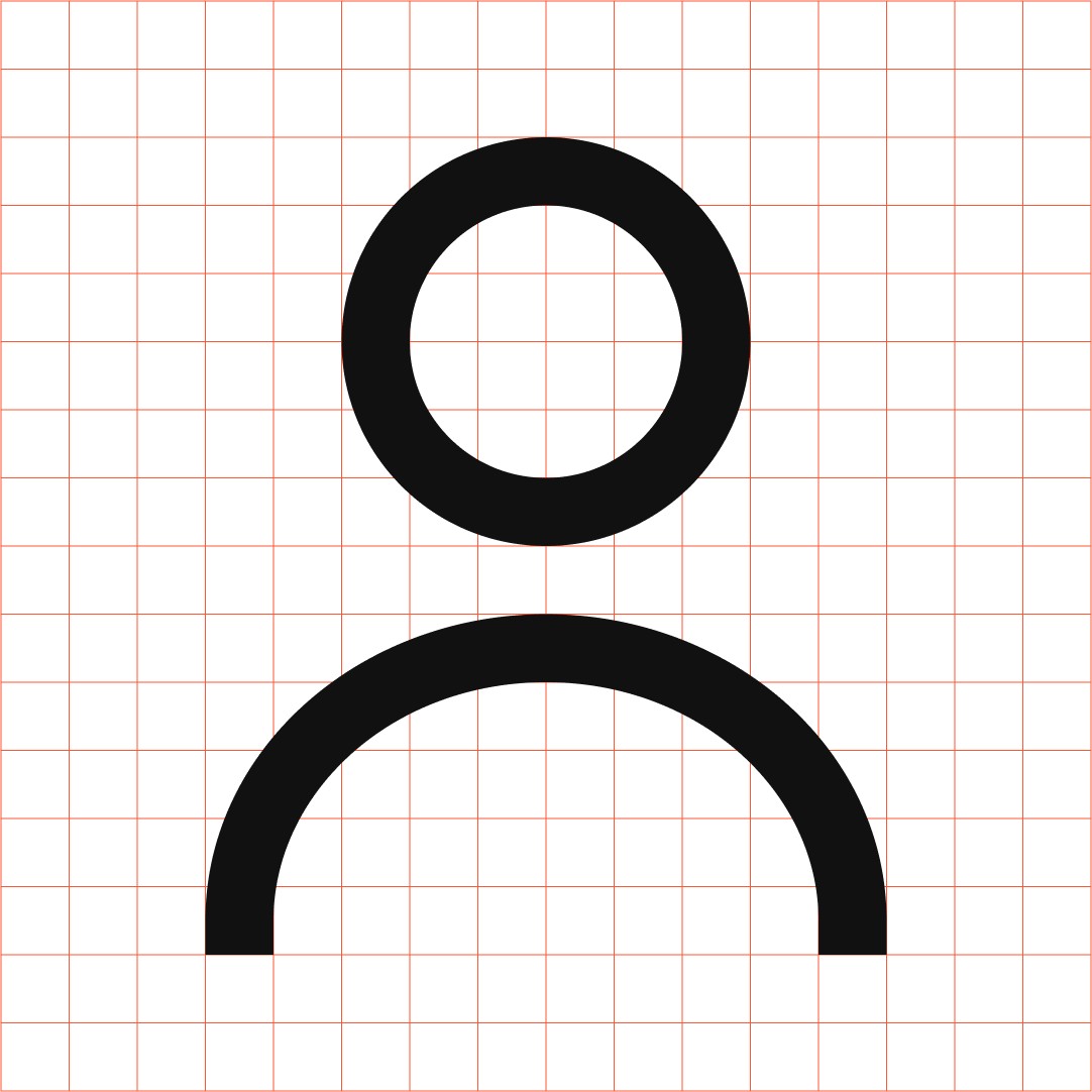
Format: 32x32px Pixel Grid: 2px Stroke: 2px
Sharp corners
All icons should be made with sharp corners, without rounding.
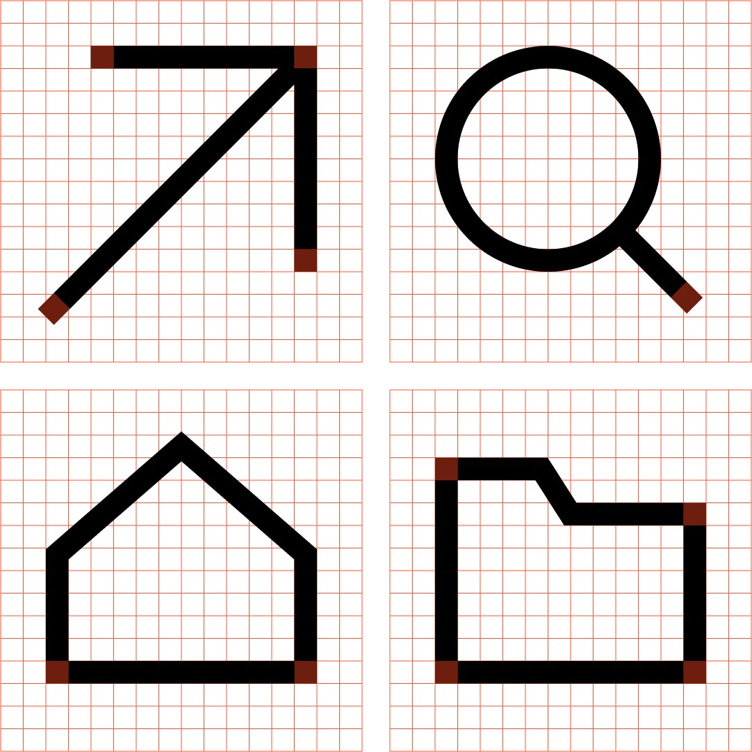
External angle: 90° Internal angle: 90°
Function icons
Function icons are used for:
Small sizes
User Interface and UX
Action or object
Support for interactivity
Avoid decorative icons. They are reserved for functional use only.

Building
Grid
To create consistency, the icons are drawn on a 32x32px grid as a starting point. Always use this grid when creating icons to maintain a consistent and functional look.
Icons have been designed to work best in four sizes:
16×16 pixels
20×20 pixels
24×24 pixels
32×32 pixels.

Format: 32x32px Pixel Grid: 2px Stroke: 2px
Sharp corners
All icons should be made with sharp corners, without rounding.

External angle: 90° Internal angle: 90°
Function icons
Function icons are used for:
Small sizes
User Interface and UX
Action or object
Support for interactivity
Avoid decorative icons. They are reserved for functional use only.

Building
Grid
To create consistency, the icons are drawn on a 32x32px grid as a starting point. Always use this grid when creating icons to maintain a consistent and functional look.
Icons have been designed to work best in four sizes:
16×16 pixels
20×20 pixels
24×24 pixels
32×32 pixels.

Format: 32x32px Pixel Grid: 2px Stroke: 2px
Sharp corners
All icons should be made with sharp corners, without rounding.

External angle: 90° Internal angle: 90°
Function icons
Function icons are used for:
Small sizes
User Interface and UX
Action or object
Support for interactivity
Avoid decorative icons. They are reserved for functional use only.

Building
Grid
To create consistency, the icons are drawn on a 32x32px grid as a starting point. Always use this grid when creating icons to maintain a consistent and functional look.
Icons have been designed to work best in four sizes:
16×16 pixels
20×20 pixels
24×24 pixels
32×32 pixels.

Sharp corners
All icons should be made with sharp corners, without rounding.

Function icons
Function icons are used for:
Small sizes
User Interface and UX
Action or object
Support for interactivity
Avoid decorative icons. They are reserved for functional use only.

Building
Grid
To create consistency, the icons are drawn on a 32x32px grid as a starting point. Always use this grid when creating icons to maintain a consistent and functional look.
Icons have been designed to work best in four sizes:
16×16 pixels
20×20 pixels
24×24 pixels
32×32 pixels.

Format: 32x32px Pixel Grid: 2px Stroke: 2px
Sharp corners
All icons should be made with sharp corners, without rounding.

External angle: 90° Internal angle: 90°
Function icons
Function icons are used for:
Small sizes
User Interface and UX
Action or object
Support for interactivity
Avoid decorative icons. They are reserved for functional use only.
